Jointly
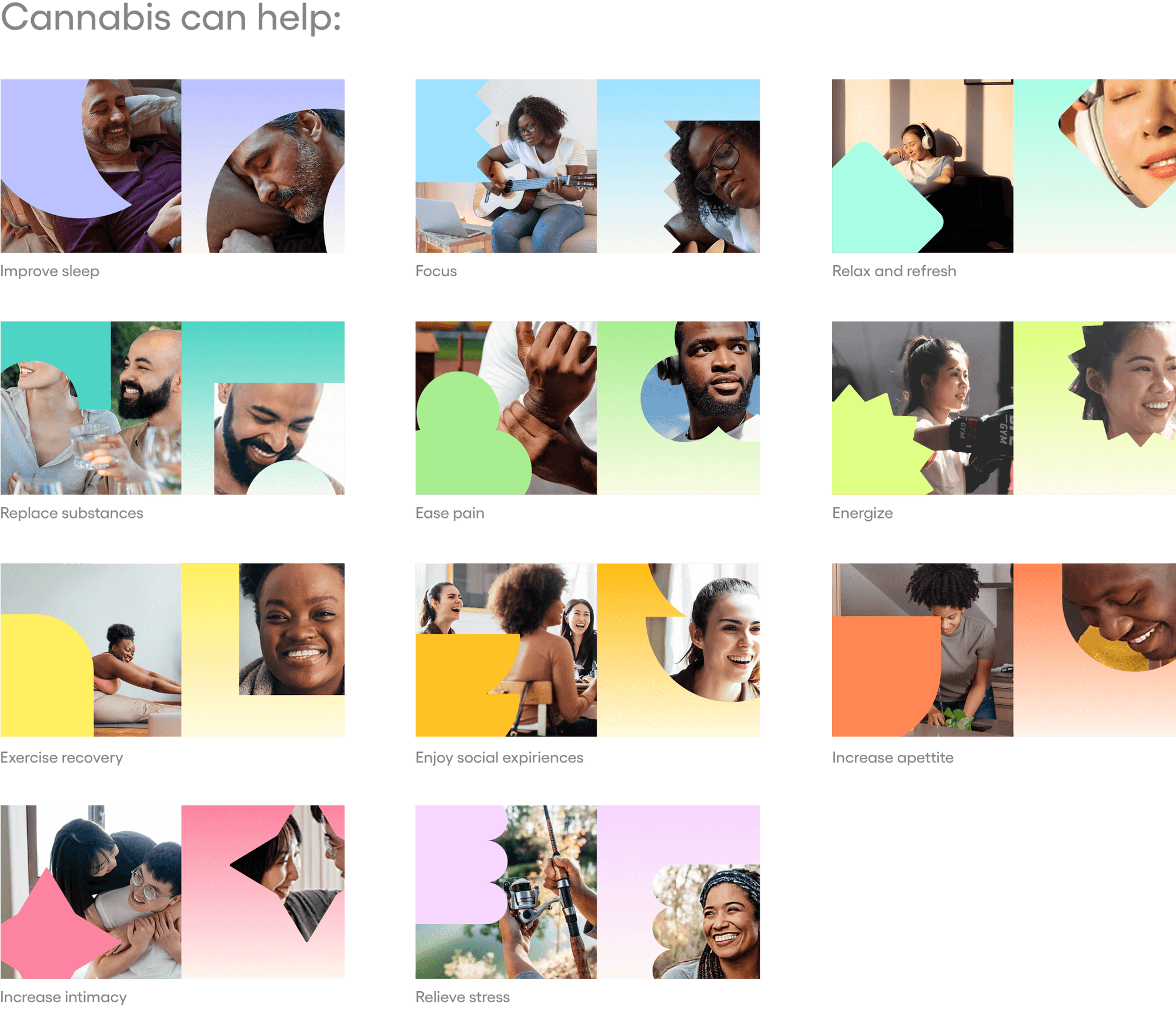
Jointly developed a cannabis consumption tracker app and asked us to refresh their brand with a focus on wellness. To kick off the process, I organized a workshop that examined brands in the cannabis space as well as established wellness apps. During this workshop, we discussed various brands and identified the tonal direction Jointly wanted to pursue. I collaborated with a Copywriter to distill our discussion into key creative principles. Using these principles, I developed multiple branding directions. We established a distinct shape and color for each “goal” featured in the app. I designed a flexible system that could either be more abstract or include images for a more literal interpretation. Next, we moved into content strategy, where I again worked with the Copywriter to define the content approach and apply the design effectively to the website.
My role: Lead Designer
Creative Director: Kate Carter
Copywriter: Nick Carter
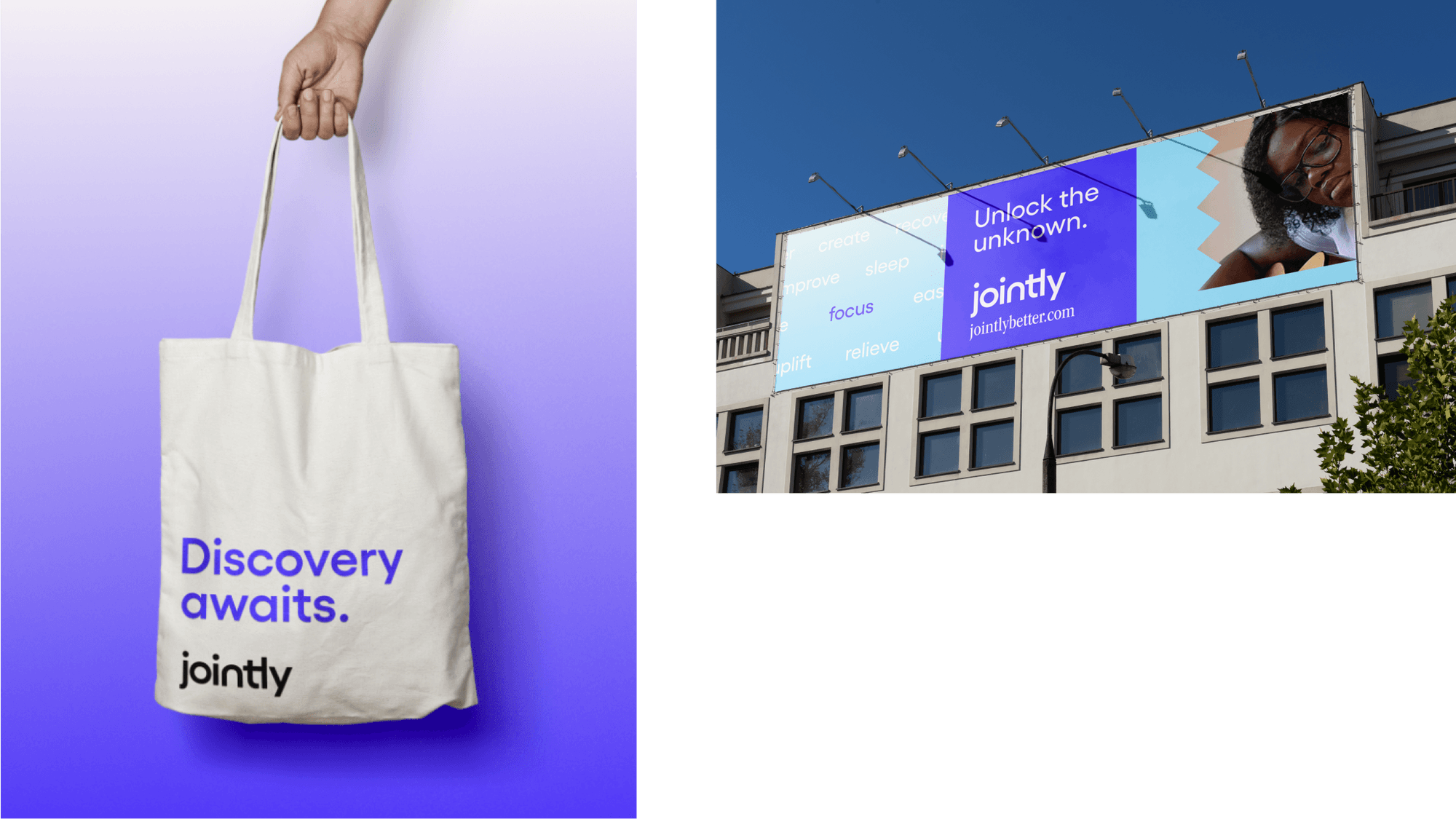
Website redesignCreative directionUI animationArt direction & designThe Jointly brand system utilizes a spectrum of shapes, colors, and gradients to communicate the different user goals, using a reimagined color palette that helps bring the Jointly brand into the tech world.
The Jointly team wanted the photography library to stay clear of traditional cannabis imagery. I sourced an expansive assortment of images that show a variety of folks doing everyday activities.


